
There is kind of a status to having your GitHub contributions chart covered in green. For those unfamiliar, it’s a calendar-like chart that shows how active you are on GitHub any given day. It’s assumed that the greener the better. I’m not so sure anymore.
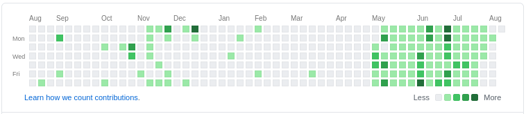
From the start of May to the end of July, I tried filling it up. Do something every day. My conclusion is that this is a typical case of Goodhart’s law. Basically as soon as a certain metric (in this case turning that chart green) becomes a goal in itself, it ceases to be a meaningful metric anymore.