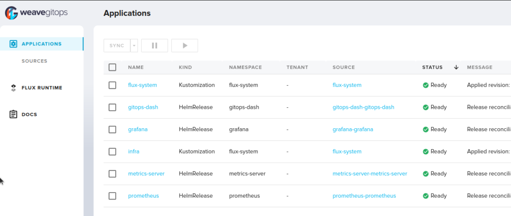
Unlike Argo, Flux has no built-in UI. CD tools should be invisible most of the time, just quietly running in the back, getting changes in the cluster. This is fine for “most of the time” when there are no changes to the applications I’m making myself or the cluster itself. It can just look at the various helm charts and other (git) sources and deploying the changes as configured. It’s nice that I can be sure that my cluster has the latest possible versions of everything running within 10-15 minutes of release (depending on the Flux interval configured) without ever touching kubectl.
On the other hand, if I have a new change in my own code that I want to get deployed, even if it’s all automated, I still want a screen to stare at for status updates. Without an UI I don’t know when/if my changes made it to production and if there were any issues along the way. Of course there is the way to kubectl watch the respective Flux resources, but honestly I can barely remember my own birthday let alone if my installation of Grafana counts as a Kustomization or a HelmRelease to watch. Not to mention we’re in 2022 and everything but my email app and terminal is a browser on my computer: Firefox is a browser, the Atom (or if you’re not allergic to it, VS Code) editor (Electron) is a browser, Spotify (Electron) is a browser. It’s just natural I expect Flux to have a nice web UI too, just like Argo does.
There used to be a standalone and client-side flux-webui, but that was deprecated and archived a long time ago already. Instead they’re recommending the Weaveworks GitOps web UI to use with Flux. Unlike the old webui, this isn’t a trivial client side thing, but instead first a CLI and also a UI installed using a helm chart. Personally I liked how clean the old webui was, but the gitops tool isn’t bad either. If you don’t actually intend to use the command, then there’s no need to install it. Get the executable, generate the YAML for the web UI and commit it to your cluster’s repo.
gitops create dashboard gitops-dash
  --password=AwesomeAndVeryStrongPassword \
  --export > ./weave-gitops-dashboard.yaml
This will generate a YAML that contains both a HelmRepository and a HelmRelease. In this Flux playground I prefer to keep my stuff clean and only have one kind of resource in a file, so I split it up and added the dashboard as another component to my cluster.

Overall it’s a really smooth experience. Just be sure to save the password you give the gitops tool somewhere, because it only saves a hash so getting it out isn’t as simple as opaque Secrets. Though if you install it “properly” through git then changing the password shouldn’t be hard either (run the command again).
If I have to sum it up in one pro and one con, the pro would be that it feels way faster than Argo’s UI. I don’t know how the underlying server-side implementations are different, but it feels like the GitOps UI reacts almost instantly while in Argo I’m used to looking at various spinners for seconds. The con would be that unlike Argo the GitOps UI has no way to inspect the logs from pods (at least I couldn’t find it), so for that I have to stick with kubectl logs. It’s an inconvenience, but unless your cluster is locked up real hard it’s not that much of a hurdle. If it is though, you better be forwarding your logs somewhere or else.
